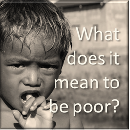
What does it mean to be poor? |

|
|
Data concept:
Band:
Suggested year level:
Relevant content description:
|
Collecting, managing and analysing data
5-6
Year 6
Acquire, store and validate different types of data, and use a range of software to interpret and visualise data to create information (ACTDIP016)
|
This series of activities was designed to be taught alongside a Geography inquiry comparing living conditions in Australia and Cambodia.
The first part of the series is a set of activities to assist the students in developing their own understanding of what data validation is and why this is important.
In the second part of the series of lessons, the students work collaboratively to create a visual display of some data that fits in with their Geography study of living standards in Cambodia. The sequence uses the Jigsaw strategy. Students are assigned a key dimension of poverty to investigate: Health, Education or Living Standard and work in large teams to collect and interpret suitable data for that topic. They then form teams of three, with an "expert" from each of the three dimensions. In their team of three, they create a collaborative infographic to compare the living standards in Cambodia and Australia.
Data Validation
Through a series of activities designed to illustrate data validation, students develop an understanding of this concept. The students are asked to record notes about their thinking about the concept of data validation and to adjust this description as their conceptualisation changes. At the conclusion of the sequence of activities, students write their own brief explanation of the concept of data validation as it relates to digital technologies.
Collecting data collaboratively
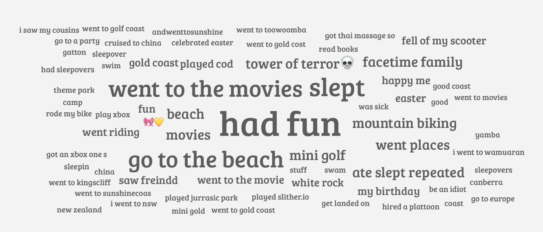
Students participate in an Answer Garden activity to collect responses to a simple question, such as "What did you do on the holidays?". They discuss observations of the collected data: popular responses are larger, you can hover over a response to determine how many people said this, responses you made yourself are in a different colour, etc. Students will notice that they can choose the same response as someone else by clicking on it and entering the response themselves. They will also notice that if a response is misspelled, it will not be recognised by AnswerGarden to be the same. The data must match exactly. Discuss ways the issues that arise in AnswerGarden if the accepted responses are not "validated".
Students reflect on this activity in terms of what they have learnt about the need for data validation.
Students reflect on this activity in terms of what they have learnt about the need for data validation.
Best Friend FinderStudents can use the Best Friend Finder activity to further investigate data validation.
Usually when we are collecting data, it is because we plan to do something with that data. This means that we not only need to know that the data is accurate, but we also need to make sure it is in the right form.
In spreadsheets, there are different data types, and this effects what you can do with the data. If a "number" is written as a word, you won't be able to use it to make a chart. If there are misspellings or differences in wording or punctuation, the system might not recognise two items as a match. |

|
Spreadsheet: an electronic document in which data is arranged in the rows and columns of a grid and can be manipulated and used in calculations.
Select each column in turn and set the data type. Will the input be a number or text? Can you pre-empt the responses and make a pop-up menu? What kinds of attributes would use a star rating or slider?
Use the + button to create a new form for the spreadsheet. Use the form to collect data from your classmates.
Name your spreadsheet and review your data. We can manipulate this raw data to create "information".
Use the + button to create a new form for the spreadsheet. Use the form to collect data from your classmates.
Name your spreadsheet and review your data. We can manipulate this raw data to create "information".
Validating numbers - Cambodia's Provinces: Populations
When we enter data in a spreadsheet, we need to validate the data to ensure that it is in the correct form. Students determine the population of each of Cambodia's 25 provinces and create a chart in a Numbers spreadsheet.
Using the information contained in the ThingLink, students determine the population of each province and collate the data in the spreadsheet. Students create a suitable chart and share a screenshot of the chart via Google Classroom.
Using the information contained in the ThingLink, students determine the population of each province and collate the data in the spreadsheet. Students create a suitable chart and share a screenshot of the chart via Google Classroom.

Validating measurements - Cambodia's Provinces: Land area
The data provided below includes a mixture of measurements units from square kilometres to acres and square miles. You will need to convert the numbers to the same unit of measurement (square kilometres) so the data is useful in your spreadsheet.
Use Google to assist your conversions. Add a column to your Numbers spreadsheet and make the heading "Land Area (km²)". Take a screenshot of your table and attach it in Google Classroom.
Use Google to assist your conversions. Add a column to your Numbers spreadsheet and make the heading "Land Area (km²)". Take a screenshot of your table and attach it in Google Classroom.
How is data validation used when I book a trip to Cambodia?
There are numerous online tools that assist travellers in researching and planning trips and holidays.
Imagine you were planning a trip to Cambodia using the Trivago website.
What kinds of data is available on the website? When you are searching for accommodation in a particular province, how is data validation used to help get you the right information more easily?
Imagine you were planning a trip to Cambodia using the Trivago website.
What kinds of data is available on the website? When you are searching for accommodation in a particular province, how is data validation used to help get you the right information more easily?
Data or Information?
Data is a collection of unorganised facts. Data can be numbers, text, images, sounds, and videos. Bits of data on their own can be random and not very useful until they are organised in some way.
Computers can store and process data to create information. Information is data that has been organised in some kind of meaningful way.
Computers can store and process data to create information. Information is data that has been organised in some kind of meaningful way.
Turning data into information
Raw data can be made more meaningful by manipulating it in different ways. Calculating averages (mean, median and mode), totalling data, counting a number of occurrences or colour coding can be a useful start.
Often data is manipulated into charts (or graphs) to make the "picture" or "story" clearer.
Often data is manipulated into charts (or graphs) to make the "picture" or "story" clearer.
Using a spreadsheet to transform data into information...
How crowded are the provinces in Cambodia? Which provinces are more densely populated?
Add a third column to your spreadsheet. This column will be labelled "Population Density". The population density is how many people per square kilometre.
Enter a formula in D2 to calculate the population density for the first province. Copy this same formula into the other cells in this column.
Sort the data from most densely populated to least densely populated. Share screenshots showing the names and population densities of the most and least densely populated provinces to Google Classroom.
Assessment of Student Understanding
What is data validation? Explain in your own words what data validation means and why it is important. Use examples from things we have done in class to show your understanding.
Share your response to Google Classroom.
You should include:
Share your response to Google Classroom.
You should include:
- Clear statement defining data validation.
- Reasons why data validation is important.
- Examples from class activities and discussions that show your understanding of data validation.
Introducing Infographics
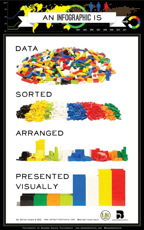
Infographics are a visual means of displaying data to make it more meaningful. People have used images to display messages for thousands of years, but the popularity of internet and social media have resulted in a huge increase in "infographics" in recent years.
View these infographics and videos to find out more about infographics.
At the end of this session you should be able to explain what an infographic is and share an opinion about why you think they have become so popular.
In this lesson, teachers and students might use a class blog, Verso or Google Classroom to share their opinions with the class.
|
This TED talk by the late Hans Rosling is another awesome example of the powerful impact of data presented visually.
|
|
Collecting and collaborating
Over the next few weeks, you will be collecting, recording, analysing and presenting data to create an infographic to help people understand what it means to be poor.
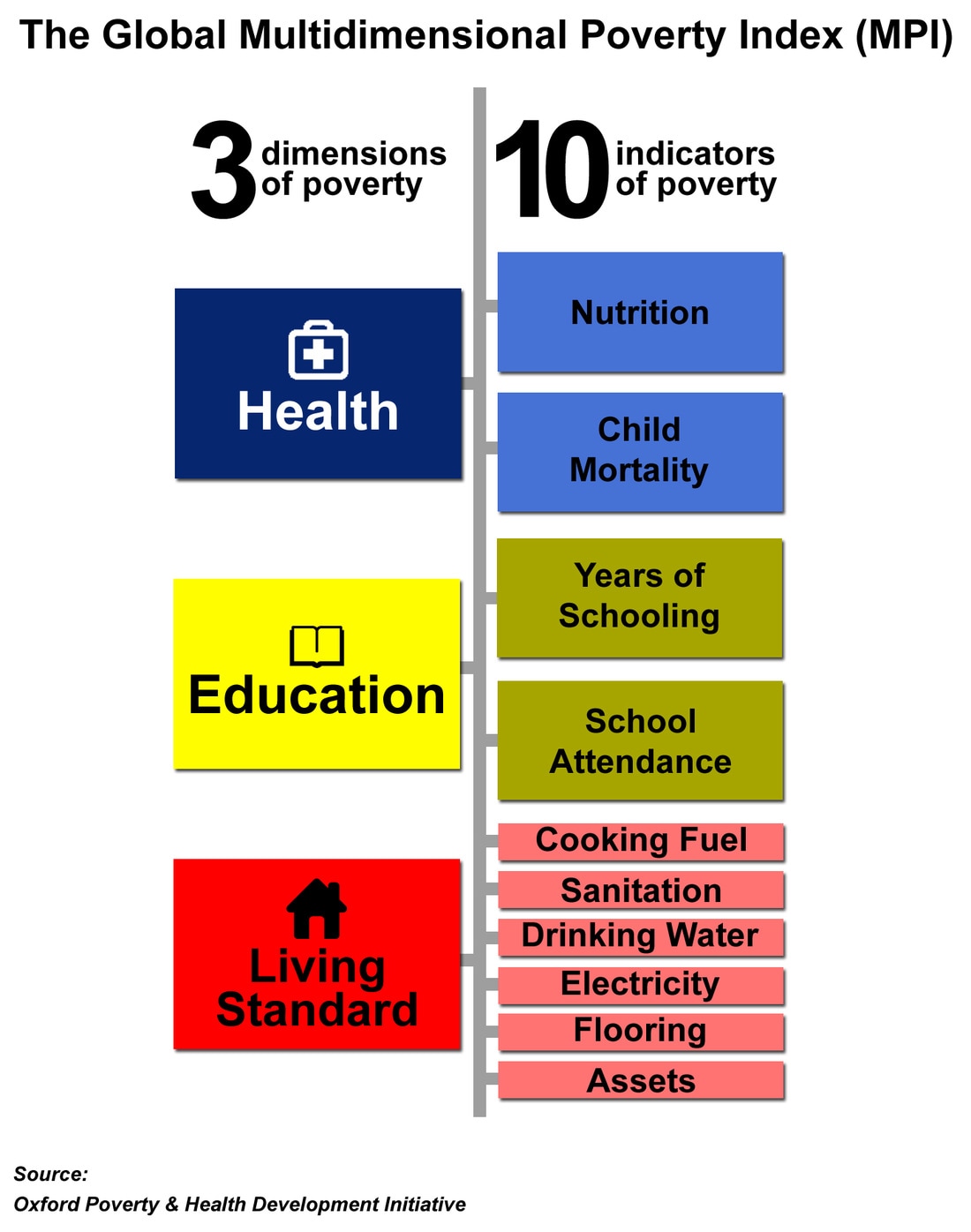
Poverty can be measured and described using the Multi-dimensional Poverty Index. You can see different dimensions and indicators of poverty in this infographic:
Poverty can be measured and described using the Multi-dimensional Poverty Index. You can see different dimensions and indicators of poverty in this infographic:
In your group, decide which of these three dimensions (Health, Education or Living Standard) each group member will focus on. Once you have reached a consensus, use the resources below to get started in your data collection.
Things to remember when collecting data:
- Your purpose for collecting data is to make an infographic that will clearly show the differences between the two countries in terms of poverty, lifestyle and access to basic services
- Collect information that is both accurate and interesting - your infographic should be a story worth telling
- Find the vital statistics that show the poverty indicators from the MPI first
- If you find a relevant statistic that you think will be of interest to your viewers, add this information in extra rows in the table
- Don't write full sentences but record enough detail so it will make sense to you later
- Keep a record of the source of information so you can revisit the site if necessary and so you can quote it later
- Check the validity of data by trying to find the same information in more than one source.
- If you find conflicting data, consider the currency of the information and the trustworthiness of the source. Look at the URLs. Sites that are .gov or .org may be more credible than .com sites.
Creating an Infographic
The class forms teams of three, with an expert in each dimension: Health, Education and Living Standards. Each student creates a data display for one key piece of data for their dimension.
Stitching it all together
Today, each of the people in your trio will take on a different role so that the task of bringing all of the images together to create one infographic will be completed.
The three roles are:
The three roles are:
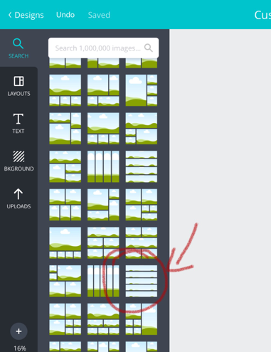
- Stitcher - You will use Canva to bring five images together into one infographic
- Header - You will create a heading or title image using Keynote or Canva for your infographic and send it to the stitcher
- Acknowledger - You will create an image or slide using Keynote that contains references for the websites your group has used throughout the task, and send the image to the stitcher
Stitcher
|
|
Header
|
Acknowledger
|
